Architecture as the Skeleton of a Tattoo
·Vladimir Kozachenko
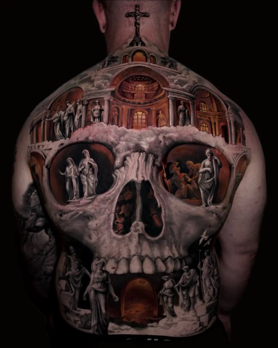
In my work architecture is almost never the background. Columns, arches, stairways and openings are the structure the whole composition stands on - the thing that decides where the eye enters, where it rests and where it leaves. This is a short account of why I build that way, written from the studio on Melrose Avenue.
Why a large piece needs a skeleton
A big tattoo is not a big picture. It is a picture on a surface that curves, moves, and is almost never seen flat or all at once. A viewer sees a shoulder from the front, then the same piece three-quarters on as the person turns, then a slice of it from behind.
A composition built only from a subject and some shading falls apart under that. A composition built on architecture does not, because architecture brings its own rules with it: verticals, horizontals, repeating intervals, a sense of near and far. Those rules survive the curve of a body.
What each element does
Columns give the piece verticals. On an arm or a leg they follow the limb and make it read as taller and more ordered. Repeated at intervals, they also create rhythm - the eye measures distance by them.
Arches carry weight and turn corners. Where a composition has to bend around a shoulder or a hip, an arch is the honest way to do it.
Stairways and passages create depth without haze. They tell the eye there is somewhere further in, which is what makes a flat area of skin read as a space rather than a surface.
Openings - doors, windows, gaps between structures - are where the light comes from. In black and grey, deciding where the light enters is most of the work.
The body draws first
Before any of that, the body decides the proportions. Shoulder blades, the line of the spine, the mass of a deltoid, the way a forearm turns as the hand rotates - these are the real dimensions of the drawing, and they are different on every person.
I read them first and place the large forms against them. Only after the big structure sits correctly on a specific body do the figures and the scenes go in. Doing it the other way round produces a design that looked good on paper and sits badly on skin.
Why this survives ageing better
Black and grey lives on value - on the difference between light and dark masses, not on colour. Over time the finest internal texture softens. What stays is the structure: the big lights, the big shadows, the silhouette.
A piece whose meaning lives in its architecture still reads clearly decades later, when the delicate rendering inside the stonework has settled. That is the practical reason I moved away from copying photographs and toward building compositions like relief sculpture.
What this means for a consultation
Bring the theme rather than a finished picture: what the piece is about, which references move you, which part of the body you have in mind. Photographs of that area, including any existing tattoos, let the structure be drawn for your body from the first sketch.