Renaissance and Baroque Tattoos: What the Style Actually Means
·Vladimir Kozachenko
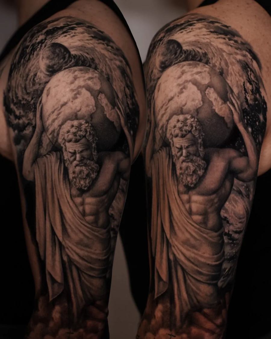
Clients come in with a phone full of saved images and one word: baroque. Usually what they mean is "a marble statue, dramatic light, something old and European". That is a fine starting point, but Renaissance and Baroque are two different languages, and choosing between them changes the whole design - the pose, the light, the amount of empty skin. This is how I think about the difference when I plan a piece.
The short version of the difference
Renaissance is balance. Figures stand calmly, weight on one leg, the composition sits inside a clear geometric frame, light is even and describes form without theatre. Think of a standing figure carved to be looked at slowly, from the front.
Baroque is motion and drama. Bodies twist, drapery flies, light comes from one side and cuts hard, and the composition spirals rather than sits. Nothing is symmetrical for long.
On skin this matters immediately. A Renaissance composition wants a calm, flat-ish area and a vertical axis - a forearm, a calf, the centre of a back. A Baroque one wants a surface that already moves - a shoulder into a chest, a hip into a thigh - because the twist of the body is part of the drawing.
Marble is not grey
The most common mistake in "statue tattoos" is rendering marble as a smooth grey gradient. Real carved stone does something else: it holds a sharp edge where the chisel left a plane, then falls off into a very soft half-tone, and it glows slightly in the shadow because light scatters a few millimetres inside the stone before coming back out.
Translating that into black and grey means keeping the edges that describe the form crisp and letting almost everything else stay soft. Where people go wrong is the opposite: soft edges everywhere and one harsh outline around the whole figure.
Drapery is the hardest part and the most valuable
Fabric is where a piece like this is won or lost. A fold is not a line; it is a change of direction of the surface. If the folds are drawn as parallel stripes, the cloth reads as a painted flag. If each fold is built as a plane turning away from the light, the cloth reads as weight - and weight is what makes a figure look carved rather than printed.
Practically: fewer folds than the reference, each one fully resolved. A tattoo cannot carry the same count of small folds as a painting, because in ten years the small ones will merge.
One light source, and it must be chosen before the drawing
In a photograph of a statue the light was chosen by whoever took the photo. On a body, the light has to be chosen by the artist, and it has to agree with the shape of the limb.
I pick the direction of light so that the brightest area falls on the part of the body that is naturally highest - the top of a shoulder, the front of a thigh - and let the shadow run into the sides that turn away. When the light in the tattoo fights the actual form of the arm, the piece looks flat no matter how good the rendering is.
Choosing a reference that will survive as a tattoo
Good references share a few traits: a clear silhouette, a readable pose, a light source you can name, and not too many characters. Five figures in one composition will become five grey blobs at conversational distance.
Bad references are usually beautiful paintings with enormous depth of field and dozens of small elements. They can still be used - but as a source for one figure, not as a scene to copy whole.
Public-domain sculpture and painting is a deep well, and there is no reason to copy a living artist's work. If you bring me someone else's tattoo, I will use it to understand what you like and then draw something of your own.
Size, placement and how long it takes
This kind of work needs room. A single figure with drapery and a stone plinth is realistically a large forearm piece at minimum, and it lives more comfortably on a thigh, a calf, a shoulder or a back. Multi-figure compositions are back, chest and sleeve territory.
Large black and grey work is built in sessions, with healing time in between, and the drawing is adjusted on the body between sessions rather than fixed on paper in advance.